Visual Contrasts and TGD Part M Compliance
Understanding Visual Contrast and Accessibility Requirements
TGD Part M (Disability Access) aims to foster an inclusive approach to the design and construction of the built environment. The requirements of Part M (M1 – M4) aim to ensure that regardless of age, size or disability buildings are accessible and usable. Visual contrasts between elements assist people, especially those people with vision impairment or people with intellectual disabilities, in accessing a building and fully utilising the relevant facilities in and around a building. Visual contrast between certain elements also assists in providing spatial information to people with vision impairment and thus facilitates way finding. Visual contrast sensitivity is the ability to perceive differences between an object and its background e.g. a handle from the door or the nosing from the rest of the step.
Light Reflectance Value (LRV) and Visual Contrast Standards
The amount of light a surface reflects is known as the Light Reflectance Value (LRV). The range of LRV is 0 (black) to 100 (white). The larger the difference between the LRV of each surface the greater the visual contrast is and the easier it is for someone with a low visual contrast sensitivity to perceive the difference. BS8300:2009 Annex B provides several methods for measuring LRV and provides guidance on acceptable LRV differences between adjoining surfaces. The difference in the LRV of the surfaces should be 30 points or more when measured in accordance with BS 8300:2009 Annex B or BS 8493:2008. For large areas such as walls and floors a difference in the LRV of 20 points or more is acceptable, provided the illuminance on the surfaces is 200 lux or more. For door opening furniture, a difference in the LRV of 15 points between the product and its background is acceptable.
Common Building Elements Requiring Visual Contrast Compliance
Compliance with TGD Part M, in terms of visual contrasts, must be considered from the outset of a project. Visual contrasts must also be a consideration for the entire project team as visual contrast between elements is a requirement for a wide range of finishes, facilities, controls etc. which cover a range of designers and sub-contractors. Common items which require adequate visual contrast include:
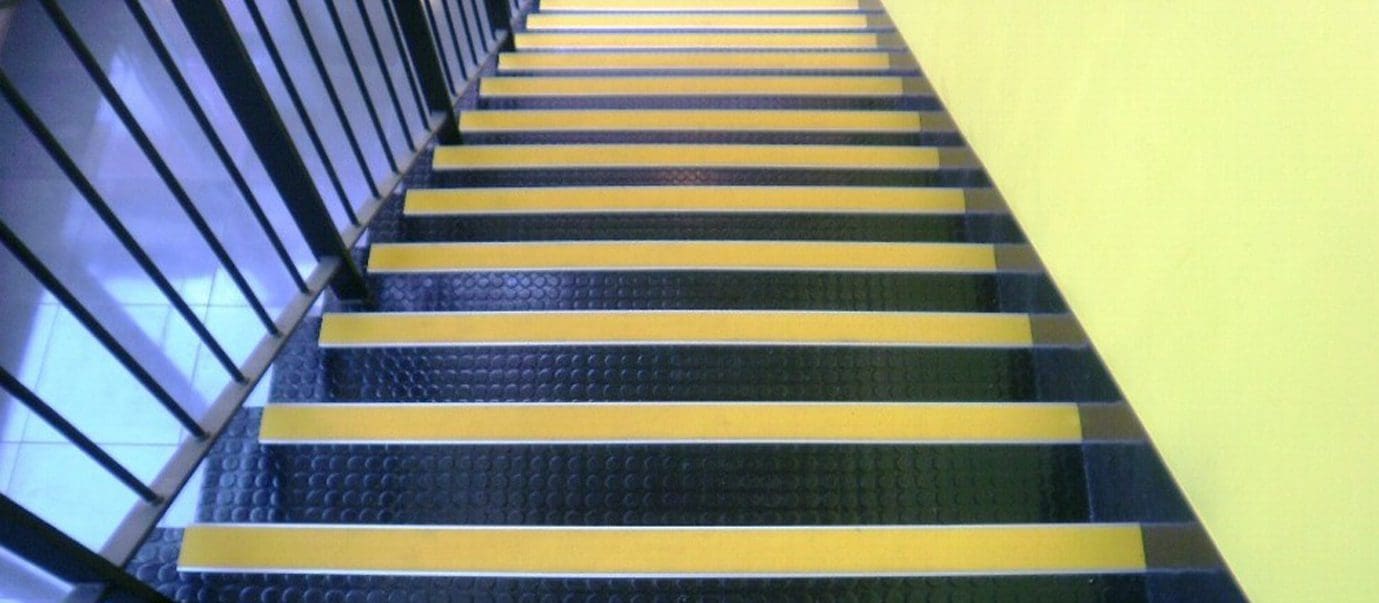
- All step nosings should incorporate a permanently contrasting continuous material on the tread. The material should be between 50 mm and 65 mm wide on the tread and should contrast visually with the remainder of the tread. All strips should have the same colour including first and last.
- The background against which handrails are seen should contrast visually without being highly reflective.
- The main entrance should be easily identified among the other elements of the building under all lighting conditions, shadow or strong sunlight e.g. by lighting and/or visual contrast. Glare and reflection from lighting or materials should be avoided as it is confusing for those with vision impairment.
- An accessible glass door should be clearly defined with permanent manifestation on the glass, within two zones, from 850 mm to 1000 mm and from 1400 mm to 1600 mm above the floor, contrasting visually with the background seen through the glass (from inside and outside) in all lighting conditions. The edges of a glass door should also be apparent when the door is open.
- All door-opening furniture should contrast visually with the surface of the door.
- Internal doors, door frames or architraves should contrast visually with the surrounding wall.
- The access zone of an accessible car parking space should contrast visually with the adjoining surfaces to ensure it is kept clear.
- Bollards should contrast visually with their background.
- If a glass door is adjacent to, or is incorporated within, a fully glazed wall or glazed screen, the door and wall or screen should be clearly differentiated from one another, with the door being more prominent e.g. the door may be framed on both sides and on the top by an opaque high-contrast strip at least 25 mm wide.
- Manual activation controls of accessible power-operated doors should contrast visually with the surrounding background.
- The surface of the leading edge of any internal door that is not self-closing, or is likely to be held open, should contrast visually with the other door surfaces and its surroundings so it does not to create a hazard
- Any full height glazed screens alongside a corridor or passageway should be clearly defined with manifestation on the glass at two levels, 850 mm to 1000 mm and 1400 mm to1600 mm contrasting visually with the background seen through the glass in all lighting conditions.
- Lift landing and lift car doors should contrast visually with the adjoining walls. All call and control buttons should contrast visually with the surrounding face plate and similarly, the face plate should contrast visually with the surface on which it is mounted.
- A handrail of contrasting colour with its surroundings should be provided on at least one wall of the lift car.
- The surface finish of sanitary fittings, grab rails and doors, should contrast visually with their background. There should also be a visual contrast between wall and floor finishes.
- All general controls should visually contrast with their backgrounds to facilitate people with vision impairment.